Are you searching for the perfect exterior house colors? With thousands of paint colors to pick from, deciding on the right colors can be overwhelming. That’s why we’re here to help!
Painting the exterior of your home is a big decision with several factors to weigh, like boosting curb appeal, complementing your home’s architectural style, and expressing your personal taste. With so many possibilities, it can be tough to know where to begin.
While selecting a paint color is ultimately a personal choice, exploring current trends can spark inspiration and reveal what styles resonate with designers and homeowners today. Below, we’ll take a deep dive into this year’s most popular house colors that our team of professionals recommends, leaving you feeling inspired and confident in your choice for your upcoming paint project.
In addition, we’ll suggest ways you can increase home appeal through limewashing brick, staining wood, and painting your garage door.
Tips for Choosing Your Exterior Paint Colors
-
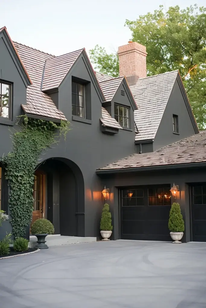
Dark exterior colors can add a touch of sophistication, especially when contrasted with lighter shades.
-
For a more organic and subtle aesthetic, warm neutrals offer a soft, natural appeal.
-
Consider other exterior elements, such as wood, stone, or brick accents, when selecting your color palette to ensure a harmonious overall look.
When deciding on paint colors for your home, we always recommend testing and sampling colors on your home before committing. Brands like Sherwin-Williams and Benjamin Moore offer paint samples and peel-and-stick color cards that help you see exactly how colors look on your home.
Align Exterior Colors with Outdoor Hues
Observe Your Home’s Lighting
Colors can shift dramatically depending on the lighting. A paint color beneath a shaded tree may appear significantly darker than the same hue under direct sunlight. The direction your home faces also plays a role in how a color is perceived throughout the day.
To get a true sense of how a color will look, it’s best to test paint samples in different lighting conditions.
Additional Tips for Picking Exterior Paint Colors
Don’t Overlook Painting Your Garage Door
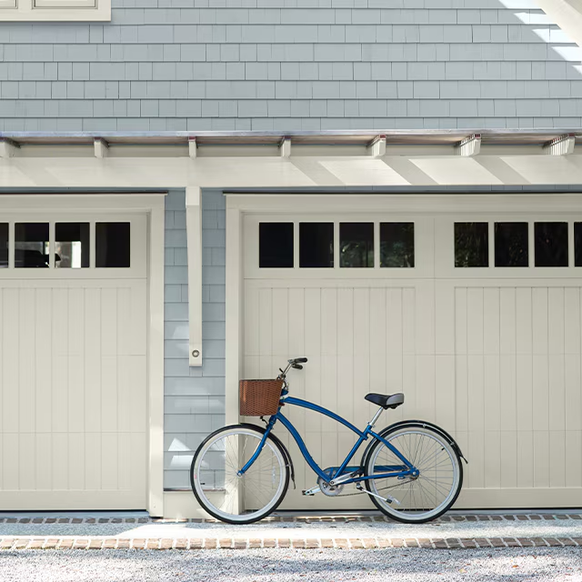
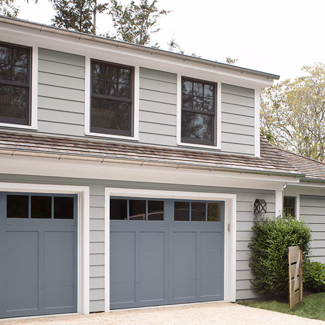
Refreshing your garage door with paint is a quick and cost-effective way to boost curb appeal. It’s often one of the largest features on the front of your home, so it deserves thoughtful color selection. A garage door can be a great place to introduce contrast or reinforce cohesion. An exciting approach is to match the garage and front door with a bold contrasting color, emphasizing the contrasting nature of the colors. For example, white on the body, black on the trim, and then picking a rich, deep brown for the garage and front door. There are many ways to be creative when you include the garage doors.
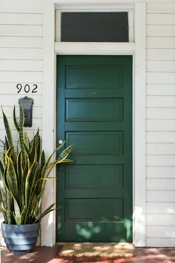
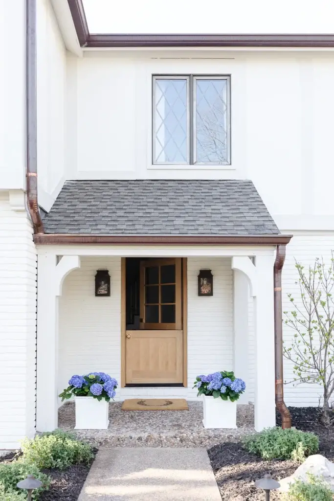
Elevate Curb Appeal with the Perfect Front Door Color
Your front door is one of your home’s most impactful exterior design elements. A carefully chosen color doesn’t just enhance curb appeal—it sets the tone for your home and creates a welcoming first impression. Whether you want to make a bold statement or keep it classic, your front door should complement the overall palette of your exterior, including siding, trim, landscaping, and decor.
To create a cohesive look, consider how your front door color pairs with the rest of your home’s exterior features. Whether you opt for a vibrant hue or a subtle shade, the goal is to highlight architectural details and reflect your style.
Choose the Right Sheen for Every Exterior Surface
Exterior paints come in a variety of sheens, and choosing the right one can impact your finish’s look and durability. Here’s a quick guide to common sheens and where they work best:
-
Matte / Flat: Siding, trim
-
Low Lustre / Eggshell: Siding, trim, shutters, doors
-
Satin: Siding, trim, shutters, doors
-
Semi-Gloss: Trim, shutters, doors, architectural accents
-
Gloss / High-Gloss: Doors, standout architectural features
Ask your local painting professionals for guidance based on your home’s style, surface materials, and exposure to elements. Your home may be showing signs you need exterior house painting.
Increase Curb Appeal with Wood Stain
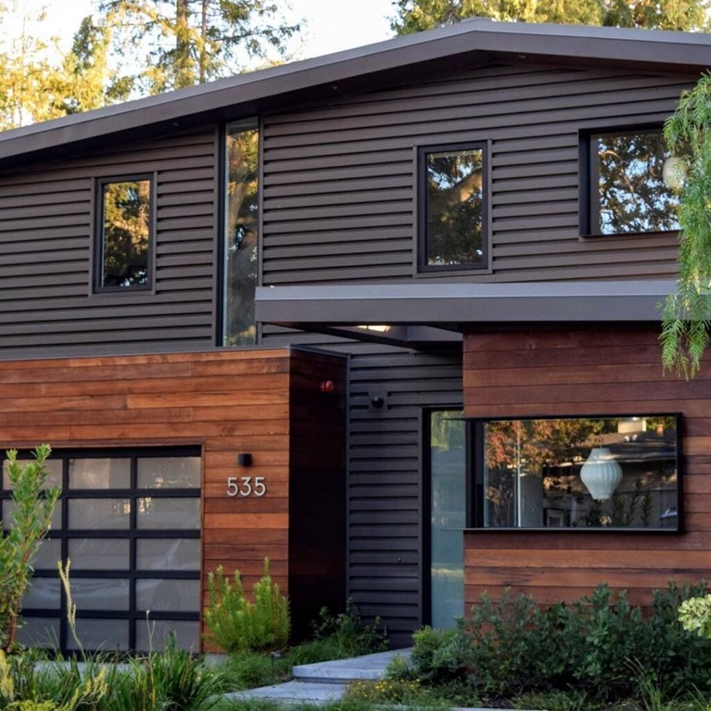
Choosing the right exterior stain plays a key role in both boosting your home’s curb appeal and shielding wood surfaces from the elements. Whether you’re aiming for a natural wood aesthetic or a striking, modern finish, the right stain color can transform your exterior. Unlike paint, stain enhances the wood’s natural grain and texture, adding warmth and character that paint can’t match. If your home includes wood siding, soffits, columns, or doors, consider using a rich stain to either complement your main paint color or create contrast for visual interest.
Timeless Style with Limewash Brick
Limewash is a centuries-old finish made from crushed limestone, water, and natural materials. Unlike paint, limewash is absorbed into the surface, making it ideal for porous exteriors like brick, stone, or stucco. Its natural off-white tone offers a soft, matte look that highlights the texture and character of brick homes.
Whether you’re updating a historic home or adding character to a newer build, limewash offers a breathable, durable finish that blends beauty and function.
Popular Exterior Paint Color Trends of 2025
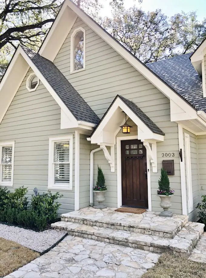
Sage Greens
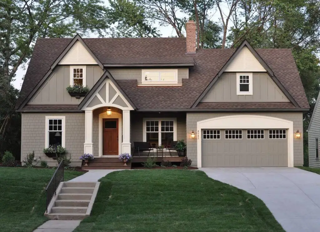
Leading the way in 2025’s exterior paint trends is earthy sage greens, a soft and adaptable shade that brings a sense of calm and connection to nature. This muted tone pairs effortlessly with white trim and warm wood details, while complementing architectural styles like Craftsman homes or cozy cottages. Whether your home is tucked into a wooded landscape or set in a more urban environment, sage green offers a timeless, welcoming presence.
Why choose a sage green palette for your home’s exterior?
-
Creates a strong connection to the natural surroundings
-
Strikes a perfect balance between subtlety and character
-
Enhances materials like brick, stone, and wood with understated elegance
Warm Neutrals
Warm, neutral exterior colors such as olive green, beige, cinnamon, and terracotta are perfectly in step with the natural-inspired hues trending in 2025. These shades not only enhance the earthy surroundings of your home but also add warmth to the facade while helping to mask dust and dirt.
Why choose a warm neutral palette for your home’s exterior?
-
Reflects and complements the natural landscape
-
Pairs beautifully with existing features like stone, wood, and greenery
-
Adds warmth and dimension to otherwise flat or cool-toned grays
Our Favorites:
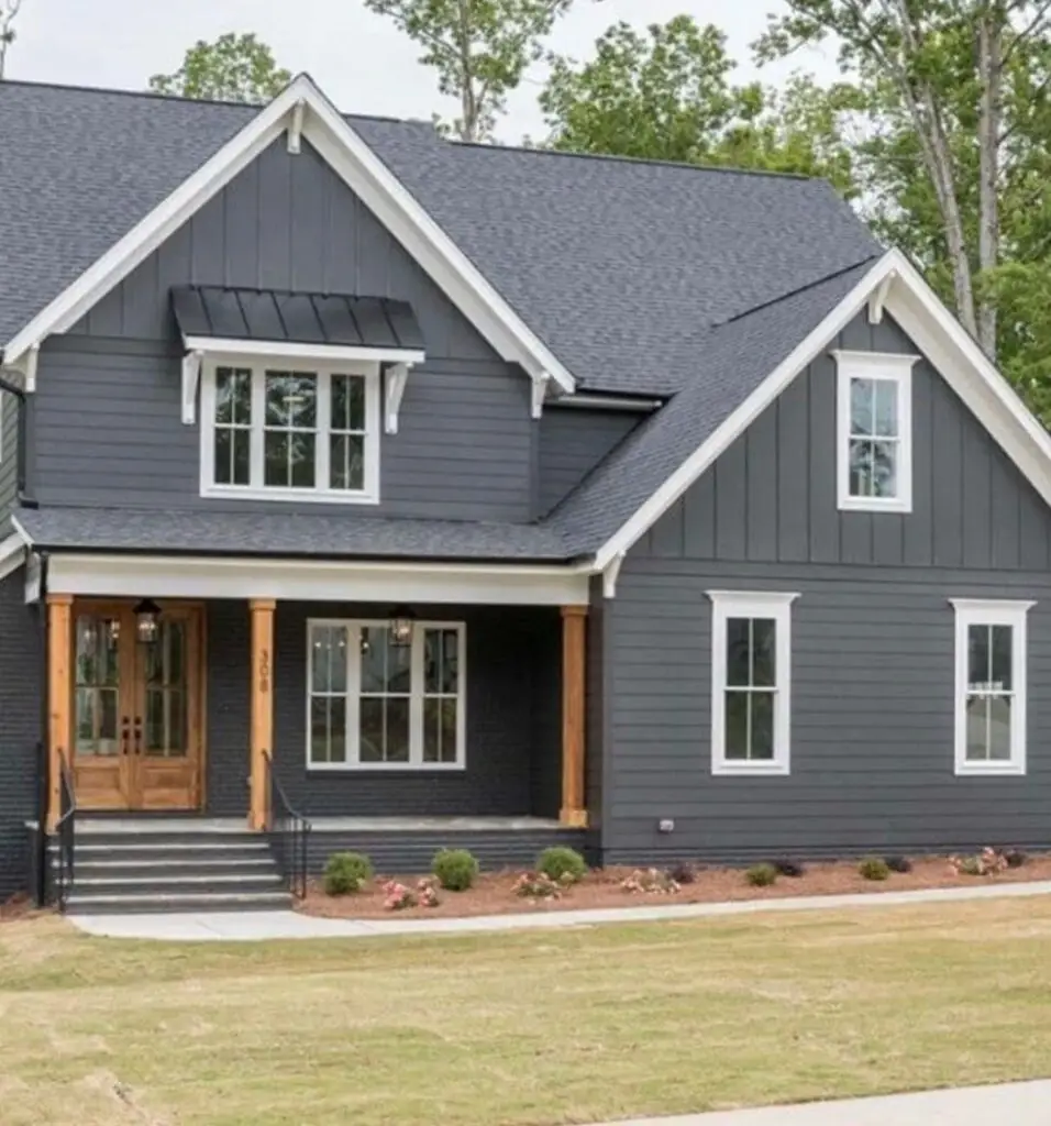
Rich Browns
-
Urbane Bronze by Sherwin-Williams
In addition to greens and warm neutrals, blue is emerging as a standout choice for home exteriors in 2025. Its timeless appeal, paired with its ability to add depth and personality, makes it a favorite among homeowners and designers alike. Often associated with calm, peace, and tranquility, blue works beautifully alongside warm stone or natural wood accents, offering exceptional versatility.
Light, breezy blues create a cheerful, uplifting look, perfect for coastal or suburban homes. For a bright, clean façade, pair these shades with crisp white trim. If you’re aiming for more contrast and visual interest, incorporate warm wood elements, such as a pergola or cedar details, to add richness and dimension.
Our Favorites:
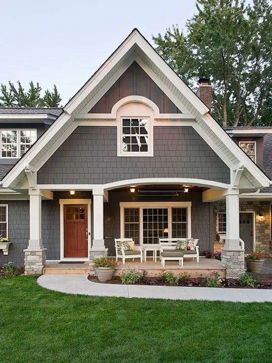
Surprisingly versatile, charcoal gray isn’t just for contemporary homes. It also elevates traditional architecture, especially when paired with refined details like copper gutters or brass light fixtures. It creates a dramatic yet tasteful backdrop for lush landscaping and brings depth and dimension to any façade. We recommend balancing their richness with soft, light trim colors such as Snowbound or Alabaster by Sherwin-Williams.
Creamy Whites
One standout in the white family is Swiss Coffee. A warm and creamy shade that feels as inviting as its name suggests. Unlike crisp, bright whites, Swiss Coffee leans into subtle yellow undertones, casting a soft, golden glow that evokes a cozy, vintage-inspired charm. While it doesn’t reflect as much light as a true white, it creates a welcoming warmth that’s perfect for adding character and curb appeal to the exterior of your home.
Our Favorites:
Most Popular Exterior Paint Colors of 2025
Illusive Green by Sherwin-Williams is a dark, contemplative green gracefully balanced by subtle cyan and gray undertones. Elegant and timeless, this soothing shade shifts gently with the changing light throughout the day. In the morning, its cool cyan qualities are more pronounced, while later in the day, it can take on a slightly warmer tone, though the shift remains soft and understated.
What makes Illusive Green truly stand out is its versatility. It complements a wide range of home styles, from classic Craftsman to sleek contemporary and breezy coastal designs. On modern exteriors, it softens clean lines and adds depth. On traditional homes, it introduces a fresh, grounded feel.
This color pairs exceptionally well with natural materials like stone, brick, and wood. Stones with gray or beige tones highlight the color’s earthy, calming quality. Wood accents, especially in rich stains like walnut or mahogany, create a striking contrast and warmth. For homes near the coast, lighter wood tones offer a more relaxed, sun-washed effect. If you’re aiming to introduce warmth without wood, Illusive Green also looks beautiful alongside metal elements such as copper gutters or Corten steel planters, adding a refined, textural layer to the exterior. As the main body color, Illusive Green pairs well with classic whites, deep grays, or blacks on the trim. It also pairs seamlessly when two-toning with a darker shade of green.
Recommended Color Scheme
-
Front Door: Bark Semi-Solid Stain by Cabot
Ideal for homeowners seeking warmth and a cozy exterior, making it one of 2025’s most popular exterior paint colors. Accessible Beige is a warm neutral beige with its unique blend of grey undertones, which is hard to find for beige colors. It offers a warm, snug feeling while leaving your home’s exterior looking modern and clean.
It pairs seamlessly with earthy tones, and its versatility allows homeowners to get creative with color pairings.
It looks crisp and clean alongside whites like Chantilly Lace by Benjamin Moore or White Dove by Benjamin, and brings depth when paired with richer tones like Sherwood Green by Benjamin Moore or Hale Navy by Benjamin Moore. Thanks to its soft warmth, timeless appeal, and ability to work in almost any setting, Revere Pewter remains a go-to favorite for homeowners and a staple exterior house color for 2025.
Recommended Color Scheme
-
Front Door: Kendall Charcoal by Benjamin Moore
It’s a warm greige (gray and beige) that pairs effortlessly with bold shades, particularly black or near-black tones. For example, it pairs wonderfully with Sherwin-Williams Tricorn Black as the trim color, creating a sophisticated and cohesive look. You can also go the other way and use a contrasting warm white on the trim, suggesting Urbane Bronze’s versatile nature for homeowners.
Recommending Color Scheme
-
Body Color: Urbanze Bronze by Sherwin-Williams
-
Trim Color: Shoji White by Sherwin-Williams
-
Front Door Color: Tricorn Black by Sherwin-Williams
Benjamin Moore Hale Navy (HC-154)
A rich navy with timeless appeal. Hale Navy is a deeply saturated, classic navy blue that evokes the elegance of maritime tradition while offering modern versatility. Its bold yet balanced tone makes it a go-to choice for designers and homeowners alike. Whether you’re creating a crisp coastal vibe, a sleek modern look, or a more traditional setting, Hale Navy delivers depth and sophistication.

Pair it with a bright white trim for a sharp and clean contrast, and include warm wood accents for an added cozy, grounded feel. This versatile shade continues to stand the test of time, proving that classic doesn’t mean boring.
Recommended Color Scheme
-
Body Color: Hale Navy by Benjamin Moore
-
Trim Color: Sea Pearl by Benjamin Moore
-
Front Door Color: Soot by Benjamin Moore
Benjamin Moore Boothbay Gray (HC-165)
A timeless mid-toned blue-gray that offers both style and versatility. One of its greatest strengths is its ability to adapt across a range of design styles—from clean, modern exteriors to rustic or coastal homes. It pairs beautifully with classic white trim and creates a striking contrast when combined with black accents, making it a timeless choice for a refined yet approachable look.
-
Body Color: Boothbay Gray by Benjamin Moore
-
Trim Color: White Dove by Benjamin Moore
-
Front Door Color: Iron Mountain by Benjamin Moore
Recommended Color Scheme
-
Body Color: Iron Ore by Sherwin-Williams
-
Trim Color: Westhighland White by Sherwin-Williams
-
Front Door Color: Tricorn Black by Sherwin-Williams
Sophisticated and full of depth, Benjamin Moore’s Kendall Charcoal is a moody gray that brings richness and versatility to any exterior. Unlike flat or overly stark grays, this hue features subtle green undertones that lend it warmth and dimension, shifting beautifully depending on the light.
Whether you’re updating a classic home or designing a modern retreat, Kendall Charcoal fits effortlessly into a wide range of styles.
It pairs beautifully with natural wood for a rustic aesthetic or with sleek, glossy finishes for a contemporary edge.
For a timeless look, contrast Kendall Charcoal with crisp whites like Benjamin Moore’s Chantilly Lace, a combo that accentuates architectural details and delivers clean sophistication. Want something more grounded? Try layering it with earthy tones like sage green, muted terracotta, or taupe to enhance its natural undertones and create a serene, balanced palette.
Recommended Color Scheme
-
Body Color: Kendall Charcoal by Benjamin Moore
-
Trim Color: Swiss Coffee by Benjamin Moore
-
Front Door Color: Wrought Iron by Benjamin Moore
An essential white with just the right amount of warmth. Unlike crisp, bright whites, Swiss Coffee leans into subtle yellow undertones, casting a soft, golden glow that evokes a cozy, vintage-inspired charm. While it doesn’t reflect as much light as a true white, it creates a welcoming warmth that’s perfect for adding character and curb appeal to your home.
We recommend pairing Swiss Coffee with warm elements like rich, chocolate wood trims and terracotta planters on your porch. If you’re fortunate enough to have a clay tile roof, this shade is a perfect match. However, one color to avoid when using Swiss Coffee is true white, as it can create a stark contrast that makes the off-white look dull or unintentional.
Recommended Color Scheme
-
Body Color: Swiss Coffee by Benjamin Moore
-
Trim Color: Ashwood by Benjamin Moore
-
Front Door Color: Mink by Benjamin Moore
Final Thoughts on the Most Popular Exterior Paint Colors of 2025
The most popular exterior colors for 2025 emphasize warmth, longevity, and an organic connection to natural elements. Whether you prefer earthy tones, soft deep-darks, or classic warm whites, the sky’s the limit. Undoubtedly, there are endless opportunities to refresh and elevate your home. For help on choosing the perfect color scheme for your home, we recommend Seattle’s trusted painting professionals who have served homeowners for over 30 years.
Hire Brotherton Painting for Your Exterior Paint Color Consultation
Brotherton Painting has trained professionals who can help guide you throughout the process of picking the perfect exterior paint color for your home. For over 30 years, our team of professional painters has helped Seattle homeowners pick and paint beautiful color schemes that increase their home’s curb appeal. Contact us today for a color consultation and free quote on your home’s exterior painting.
FAQs on Exterior Paint Colors
How do you choose the exterior paint colors for your house?
When it comes to choosing exterior paint colors, the best inspiration often comes from simply stepping outside. Consider hues that are compatible with your neighborhood, as well as your home's architectural style, natural surroundings, and roof color. Homeowners typically use about three to four different paint colors on their exterior, including trim and railings, shutters, front doors, porches and patios, decks and more. For professional guidance, contact your local professional painters for a color consultation.
Will darker colors fade faster?
Yes, dark exterior paint does tend to fade more quickly than lighter colors. That’s because darker shades absorb more heat and UV rays, which accelerates wear and color breakdown. The sun’s ultraviolet light weakens the chemical bonds in the paint, causing rich hues to lose their vibrancy over time. Moisture—from rain, humidity, or dew—can seep into tiny cracks in the surface, further degrading the finish and contributing to fading. In areas with extreme temperature swings, your home’s exterior can expand and contract frequently, which may lead to cracking and peeling. When this happens, the exposed pigment fades even faster. To help protect your home’s dark exterior colors, it’s important to invest in high-quality, UV-resistant paints designed specifically to withstand harsh weather and sun exposure.
Should the front door be lighter or darker than the house?
Choosing an exterior color scheme is a personal decision, and there’s no one-size-fits-all approach. Some homeowners love making a statement with bold front doors that pop against neutral exteriors, while others prefer a more monochromatic look, using different shades from the same color family to create a harmonious and balanced appearance.
How long does exterior paint last?
The life of your exterior paint depends on several key factors including paint quality, surface prep, application technique, and local climate conditions. On average, a high-quality exterior paint job can last anywhere from 5 to 10 years. Paints with higher sheens, like semi-gloss or high-gloss, often offer greater durability compared to matte or flat finishes. Regular upkeep goes a long way: minor annual touch-ups can prevent small issues from becoming major problems. To stay ahead of wear and tear, consider scheduling a yearly inspection with your local painting professionals. They can recommend whether your home needs a simple touch-up or a complete refresh.